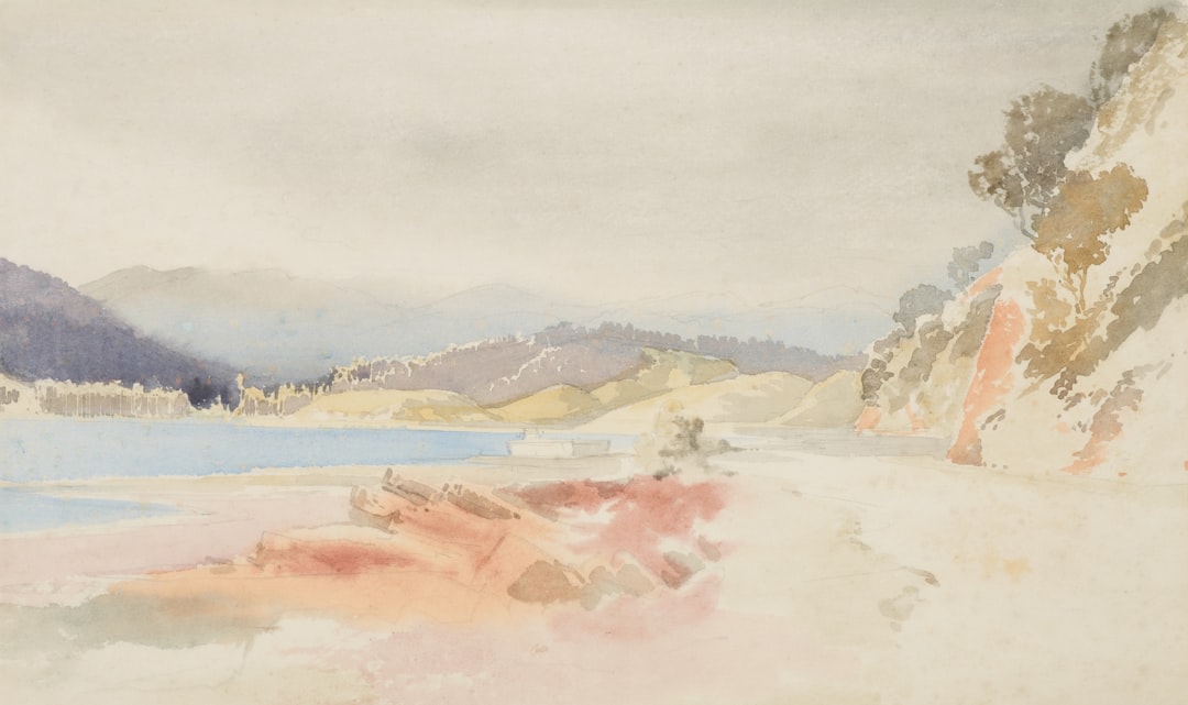
Color is perhaps the most powerful tool in an artist's arsenal. It can evoke emotions, create focal points, suggest depth, and unify compositions. Yet many artists approach color intuitively without understanding the fundamental principles that govern how colors interact. By developing a strong foundation in color theory, you can make more deliberate choices that elevate your artwork to new levels.
The Color Wheel: Your Visual Roadmap
The color wheel is the cornerstone of color theory, providing a visual organization of the color spectrum. While Sir Isaac Newton is credited with creating the first color wheel in 1666, today's artists typically use a 12-color wheel as their reference point.
Primary Colors
Primary colors are the foundation of all other colors and cannot be created by mixing other colors together:
- Red
- Yellow
- Blue
Secondary Colors
Secondary colors are created by mixing equal parts of two primary colors:
- Orange (Red + Yellow)
- Green (Yellow + Blue)
- Purple (Blue + Red)
Tertiary Colors
Tertiary colors are created by mixing a primary color with its adjacent secondary color:
- Red-Orange
- Yellow-Orange
- Yellow-Green
- Blue-Green
- Blue-Purple
- Red-Purple

Note: While the traditional RYB (Red-Yellow-Blue) color model is commonly taught to artists, it's worth mentioning that printers use CMYK (Cyan-Magenta-Yellow-Black) and digital displays use RGB (Red-Green-Blue). Each system has its own primary colors based on how color is produced in that medium.
Color Properties: Understanding the Language of Color
To discuss and work with color effectively, artists need to understand three fundamental properties:
Hue
Hue refers to the pure color itself—the quality that distinguishes one color from another on the color wheel (red, blue, yellow, etc.). It's what we typically mean when we use the word "color."
Value
Value describes the lightness or darkness of a color. Adding white to a hue creates a tint, making it lighter, while adding black creates a shade, making it darker. Value is crucial for creating contrast, depth, and form in your artwork.
Saturation (Chroma or Intensity)
Saturation refers to a color's purity or intensity—how vivid or dull it appears. A highly saturated color appears bright and intense, while a desaturated color appears more gray and muted. Adding a color's complement (opposite on the color wheel) reduces its saturation.

Color Relationships: Creating Harmony
Color harmony refers to pleasing arrangements of colors. Understanding these relationships helps artists create cohesive and visually appealing compositions.
Complementary Colors
Complementary colors sit opposite each other on the color wheel (e.g., red and green, blue and orange, yellow and purple). When placed side by side, they create maximum contrast and make each other appear more vibrant—a phenomenon called simultaneous contrast.
Applications: Use complementary colors to create focal points, energize compositions, or make elements stand out. They're particularly effective when one color dominates while the complement is used sparingly as an accent.
Analogous Colors
Analogous colors are adjacent to each other on the color wheel (e.g., yellow, yellow-green, and green). They create harmonious, unified compositions with low contrast.
Applications: Use analogous color schemes to create serene, cohesive compositions. For best results, choose one color to dominate, a second to support, and a third as an accent.
Triadic Colors
Triadic colors are evenly spaced around the color wheel, forming a triangle (e.g., red, yellow, and blue). They offer high contrast while maintaining balance and harmony.
Applications: Use triadic color schemes for vibrant, balanced compositions. For a more subtle approach, use one color predominantly and the others as accents.
Split-Complementary Colors
The split-complementary scheme uses a base color and the two colors adjacent to its complement. This creates strong visual contrast with less tension than pure complementary schemes.
Applications: This is an excellent scheme for beginners, as it's difficult to make it look unbalanced while still providing rich visual interest.
Color Temperature: Warm vs. Cool
Colors are often categorized as "warm" or "cool," which affects how they're perceived in a composition:
Warm Colors
Reds, oranges, and yellows evoke fire and sun. They appear to advance in a composition (seem closer to the viewer) and create feelings of warmth, energy, and excitement.
Cool Colors
Blues, greens, and purples evoke water and sky. They appear to recede in a composition (seem farther from the viewer) and create feelings of calm, serenity, and space.
Applications: Use warm colors to bring elements forward and cool colors to push them back, creating depth. Temperature contrasts can also create focal points and guide the viewer's eye through your composition.
Color Psychology: Emotional Impact
Colors evoke emotional and psychological responses, though these can vary across cultures and individuals. Understanding these associations helps artists communicate more effectively:
- Red: Passion, energy, danger, excitement
- Orange: Enthusiasm, creativity, warmth, caution
- Yellow: Happiness, optimism, clarity, caution
- Green: Growth, harmony, nature, fertility
- Blue: Tranquility, trust, stability, professionalism
- Purple: Luxury, mystery, spirituality, wisdom
- Black: Sophistication, elegance, power, darkness
- White: Purity, cleanliness, simplicity, innocence
Applications: Consider the emotional impact you want your artwork to have and choose colors accordingly. Remember that context, cultural differences, and personal associations can affect how colors are perceived.
Practical Applications for Artists
Creating Depth and Dimension
Understanding color can help create the illusion of three-dimensional space on a two-dimensional surface:
- Atmospheric perspective: Objects in the distance appear cooler, lighter, and less saturated than objects in the foreground.
- Temperature contrast: Use warm colors for foreground elements and cool colors for background elements to create depth.
- Value contrast: Higher contrast in the foreground and lower contrast in the background enhances the illusion of depth.
Directing the Viewer's Eye
Color can be used strategically to guide viewers through your composition:
- Contrast: Areas of high contrast (in hue, value, or saturation) naturally draw the eye.
- Saturation: More saturated colors attract attention compared to desaturated ones.
- Color accents: Small pops of contrasting color can direct attention to specific areas.

Creating Mood and Atmosphere
Color schemes significantly impact the emotional quality of your artwork:
- Monochromatic: Using variations of a single hue creates unity and can evoke specific moods (e.g., blues for calm, reds for intensity).
- Limited palette: Working with just a few carefully chosen colors creates harmony and cohesion.
- High-key palette: Predominantly light values create cheerful, airy feelings.
- Low-key palette: Predominantly dark values create mysterious, dramatic feelings.
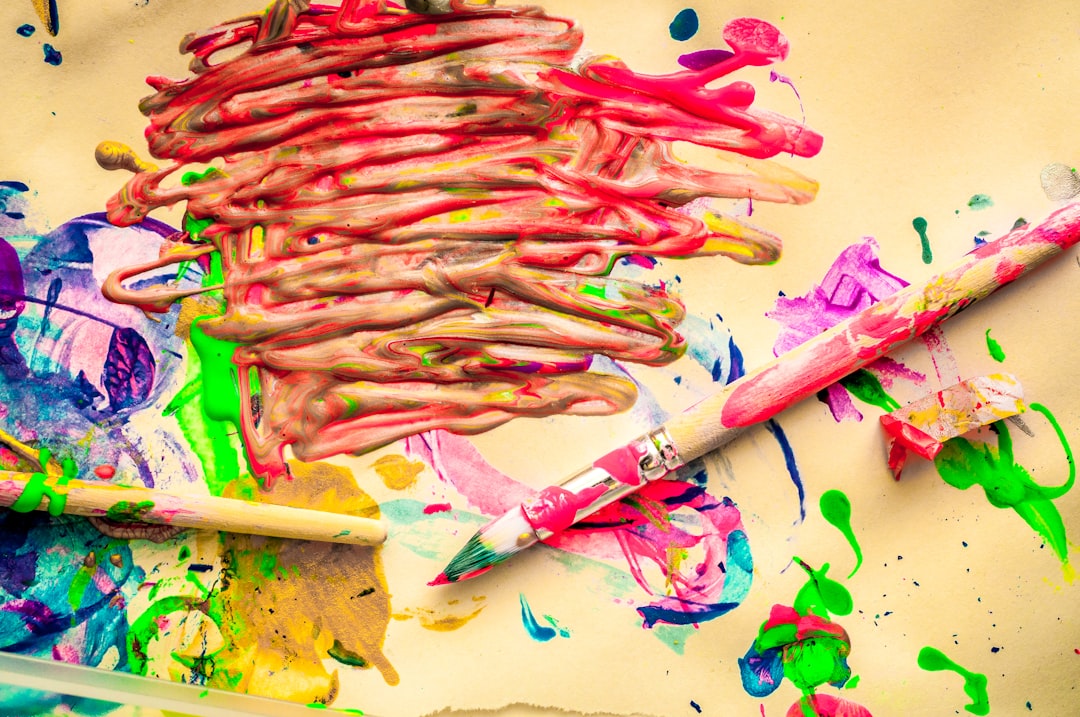
Practical Exercises to Develop Your Color Skills
Color Mixing Charts
Create a systematic chart mixing your primary colors in different proportions. This helps you understand how your specific paints or digital colors interact and builds your intuitive knowledge of color relationships.
Limited Palette Studies
Challenge yourself to create a painting using only three or four colors plus white. This forces you to mix creatively and develop a harmonious color scheme.
Color Matching
Practice matching colors you see in the world around you. Identify the hue, value, and saturation, then try to recreate it in your medium of choice.
Master Studies
Analyze and recreate the color schemes of artists you admire. This helps you understand how different artists use color to achieve specific effects.
Color in Different Mediums
Painting (Traditional)
In traditional painting, colors are created through subtractive mixing—pigments absorb certain wavelengths of light and reflect others. This means that mixing more colors together results in darker, less saturated mixtures. Understanding pigment properties (transparency, permanence, tinting strength) is crucial for effective color mixing.
Digital Art
Digital color works with additive color mixing (RGB), where combining colors creates lighter results. Digital artists have advantages like perfect color consistency, unlimited palette options, and the ability to precisely adjust hue, saturation, and value independently.
Conclusion: Developing Your Color Intuition
Color theory provides a framework for understanding how colors interact, but truly mastering color requires both knowledge and intuition. As you apply these principles in your work, you'll develop a personal sense for color that goes beyond rules and formulas.
Remember that great artists often break color "rules" intentionally for expressive purposes. Van Gogh's vibrant, emotionally charged color choices, Monet's exploration of light through color, and Matisse's bold use of non-naturalistic color all demonstrate how understanding color theory can be a springboard for creative expression rather than a limitation.
The more you consciously work with color, observe color relationships in nature and art, and experiment with different combinations, the more intuitive your color choices will become. Over time, you'll develop a personal color sensibility that enhances your unique artistic voice.