Composition is the invisible architecture of art. It's how artists arrange elements within their work to create visual interest, guide the viewer's eye, and communicate ideas effectively. While technical skill and subject matter are important, composition is often what separates good artwork from great artwork. This article explores fundamental compositional principles that artists have used for centuries, starting with the popular Rule of Thirds and expanding to more advanced concepts.
Why Composition Matters
Before diving into specific techniques, it's worth understanding why composition deserves your attention:
- Visual Impact: Strong composition creates immediate visual appeal that draws viewers in.
- Clarity of Communication: Good composition helps convey your message or story more effectively.
- Emotional Response: Different compositional choices can evoke different emotional reactions.
- Viewer Engagement: Thoughtful composition keeps viewers engaged with your work longer, guiding their eyes through the piece.
The Rule of Thirds: A Foundation for Composition
The Rule of Thirds is perhaps the most well-known compositional guideline, and for good reason—it's simple to understand and remarkably effective.
What Is the Rule of Thirds?
Imagine dividing your canvas or frame into a grid of nine equal parts using two horizontal lines and two vertical lines. The Rule of Thirds suggests placing key elements of your composition along these lines or at their intersections (called "power points").

Why It Works
The Rule of Thirds creates asymmetrical balance, which tends to be more dynamic and interesting than perfect symmetry. It also prevents the common beginner mistake of placing the subject dead center, which can create static, less engaging compositions.
Applications in Different Art Forms
- Landscape Painting: Place the horizon on either the top or bottom third line, not in the middle.
- Portraiture: Position the subject's eyes near the top third line and/or their face at one of the intersection points.
- Still Life: Arrange key objects at intersection points rather than centering them.
Pro Tip: The Rule of Thirds is a guideline, not a strict rule. Use it as a starting point, but don't be afraid to deviate when your artistic vision calls for it.
The Golden Ratio: Nature's Mathematical Harmony
While the Rule of Thirds is a simplified approximation, the Golden Ratio (approximately 1:1.618) has been used by artists and architects for thousands of years. This ratio appears throughout nature and creates compositions that feel naturally balanced and aesthetically pleasing.
The Golden Spiral
The Fibonacci spiral, based on the Golden Ratio, creates a natural flow that can guide viewers through your composition. Place your primary focal point near the center of the spiral and arrange secondary elements along its curve.

Historical Usage
The Golden Ratio can be found in countless masterpieces throughout art history, from Leonardo da Vinci's paintings to the Parthenon. While some artists used it consciously, others may have intuited its harmonious proportions.
Leading Lines: Directing the Viewer's Gaze
Leading lines are one of the most powerful compositional tools at your disposal. These are visual pathways that guide the viewer's eye through your artwork, typically toward the main subject.
Types of Leading Lines
- Explicit Lines: Actual lines in your composition, such as roads, rivers, fences, or architectural elements.
- Implied Lines: Created by the arrangement of objects, the direction of a subject's gaze, or the positioning of shapes.
- Converging Lines: Multiple lines that direct attention to a single focal point, creating emphasis.
Practical Applications
Consider how you can use the natural lines in your subject matter to strengthen your composition:
- In landscape art, use paths, shorelines, or mountain ridges to draw viewers into the scene.
- In portraiture, use the subject's posture, limbs, or clothing to create directional flow.
- In still life, arrange objects to create diagonal lines that add dynamic energy.
Balance: Creating Visual Stability
Balance in composition refers to the distribution of visual weight within your artwork. Elements have visual weight based on their size, color, texture, and position within the frame.
Types of Balance
- Symmetrical Balance: Mirror-like arrangement around a central axis, creating a sense of formality, stability, and calm. Think of a reflection in water.
- Asymmetrical Balance: Different elements that visually "weigh" the same, creating more dynamic tension and interest. A large shape can be balanced by several smaller shapes, or a bright color can balance a larger area of neutral tones.
- Radial Balance: Elements arranged around a central point, like flower petals or a spiral staircase viewed from above.
Creating Deliberate Imbalance
Sometimes, intentional imbalance can create tension, discomfort, or draw attention to specific elements. This can be particularly effective when your subject matter deals with concepts like instability, conflict, or disorder.
Focal Points: Guiding Visual Hierarchy
A focal point is where you want viewers to look first—the visual "entry point" to your composition. Most successful artworks have a clear focal point or a carefully planned hierarchy of focal points.
Creating Focal Points
There are numerous ways to establish a focal point:
- Contrast: Using differences in value, color, size, or texture to make an element stand out.
- Isolation: Separating an element from others to draw attention to it.
- Convergence: Using leading lines to direct viewers to a specific area.
- Detail: Including more detail in your focal area compared to surrounding areas.
- Positioning: Placing important elements at power points (Rule of Thirds intersections) or along the Golden Ratio lines.
Multiple Focal Points
More complex compositions may have several focal points, creating a visual journey for the viewer. In these cases, establish a clear hierarchy so viewers know where to look first, second, and so on. This can be achieved through varying levels of contrast, size relationships, or strategic positioning.

Negative Space: The Power of What's Not There
Negative space refers to the areas around and between the main subjects in your artwork. Far from being "empty" or unimportant, negative space plays a crucial role in composition.
Functions of Negative Space
- Defining Positive Forms: Negative space helps define the edges and shapes of your subjects.
- Creating Breathing Room: It provides visual rest, preventing compositions from feeling cluttered or overwhelming.
- Establishing Relationships: The space between objects defines their relationship to each other.
- Adding Meaning: Sometimes, negative space can form meaningful shapes or become an active part of the composition.
Common Mistakes with Negative Space
Beginners often fill every inch of their composition, fearing "empty" space. This approach typically results in cluttered, confusing artwork where important elements get lost. Learning to appreciate and intentionally use negative space is a sign of compositional maturity.
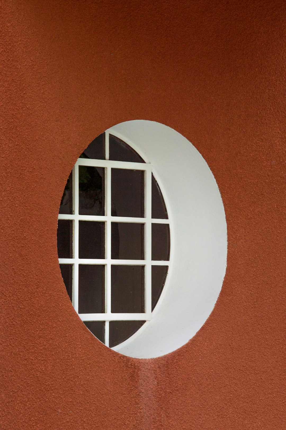
Frames Within Frames: Creating Depth and Focus
The "frames within frames" technique uses elements within your composition to create natural frames around your subject. This draws attention to the focal point while adding depth and dimension.
Natural Framing Elements
- Doorways, windows, or arches
- Tree branches or foliage
- Architectural elements
- Shadow patterns
- Foreground objects
This technique was particularly popular in Renaissance painting and remains effective in all visual arts, including photography and illustration.
Rhythm and Pattern: Creating Visual Music
Rhythm in composition refers to the repeated use of elements or intervals that create a sense of movement, like visual music. Pattern is a more regular, predictable form of rhythm.
Types of Rhythm
- Regular Rhythm: Elements repeated at predictable intervals
- Flowing Rhythm: Curved or undulating repetition creating gentle movement
- Progressive Rhythm: Elements that change gradually in size, color, or spacing
- Random Rhythm: Unpredictable repetition that still maintains visual cohesion
Rhythm can help move the viewer's eye through your composition and create a sense of harmony or, when disrupted, create attention-grabbing focal points.

Compositional Shapes: The Underlying Structure
Underlying many successful compositions are basic geometric arrangements that create stability and visual interest.
Common Compositional Shapes
- Triangular/Pyramid: Creates stability and directs the eye upward. Common in religious art and portraiture.
- S-Curve: Creates flow and grace, guiding the viewer through the composition. Ideal for landscapes and figurative work.
- L-Shape: Creates a strong foundation with a vertical element, framing the composition.
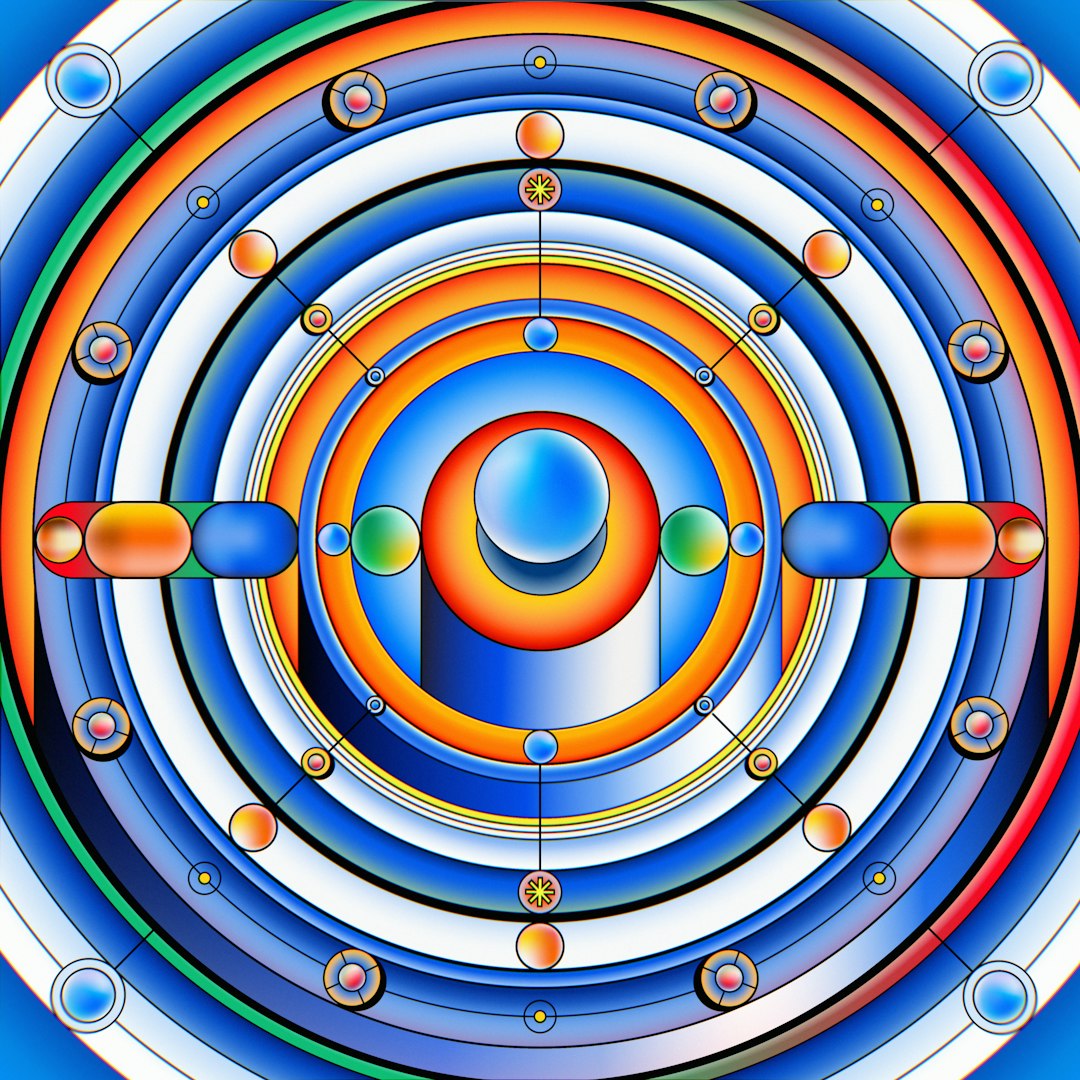
- Circular/Radial: Creates unity and completeness, drawing attention to the center.
- Cruciform: Uses intersecting horizontal and vertical lines to create balance and stability.
These shapes don't need to be literal or obvious—they can be implied by the arrangement of elements, the distribution of light and shadow, or the positioning of subjects.
Breaking the Rules: When and Why
All compositional "rules" are actually guidelines that can be broken for artistic effect. Understanding when and why to break them is part of developing your artistic voice.
When to Break Compositional Rules
- To Create Tension: Deliberate imbalance or awkward positioning can create a sense of unease that serves your concept.
- To Express Ideas: Breaking conventional composition can emphasize themes of rebellion, disorder, or unconventionality.
- To Surprise Viewers: Unexpected compositional choices can make viewers look more closely and engage more deeply with your work.
- To Focus on Other Elements: Sometimes other aspects of your art (color, technique, conceptual elements) may take precedence over traditional composition.
Important: Break rules deliberately, not accidentally. Understand the guidelines first, then make conscious decisions about when to deviate from them.
Practical Exercises to Improve Your Composition Skills
Thumbnail Sketches
Before beginning a new artwork, create multiple small, quick sketches exploring different compositional arrangements. This allows you to test ideas without investing significant time in any single approach.
Cropping Studies
Take one of your existing artworks or a reference photo and experiment with different croppings. Use a viewfinder (two L-shaped pieces of paper) to isolate different sections and see how changing the framing affects the composition.
Master Studies
Analyze the compositions of artists you admire. Create simple diagrams of their works, mapping out the underlying structure, focal points, and movement patterns. This helps you understand how successful compositions work.
Limited Element Exercise
Create a composition using only 3-5 simple shapes. Experiment with different arrangements to create balance, movement, and focal points without the distraction of complex subject matter.
Digital Tools for Composition
Modern artists have access to tools that can help analyze and plan compositions:
- Digital grid overlays for Rule of Thirds or Golden Ratio
- Image editing software to test different crops and arrangements
- 3D modeling programs for complex perspective planning
- Composition analysis apps that map out visual flow
While these tools can be helpful, don't become overly reliant on them. Developing your "compositional eye" through practice and observation is still the most valuable approach.
Conclusion: Developing Your Compositional Intuition
Composition is both a science and an art. While understanding these principles is important, the ultimate goal is to internalize them so thoroughly that they become intuitive. With practice, you'll find yourself naturally seeing and creating effective compositions without consciously thinking about rules.
Remember that great composition serves your artistic vision—it's not an end in itself. These principles are tools to help you communicate more effectively through your art. As you develop your skills, you'll learn which compositional approaches best suit your unique style and subject matter.
The most powerful compositions often combine multiple principles working in harmony. A well-composed artwork might use the Rule of Thirds for overall structure, leading lines to guide the viewer's eye, contrast to establish a focal point, and rhythm to create movement and interest.
Most importantly, keep creating and analyzing. The more you practice compositional thinking, the more naturally it will become part of your creative process.